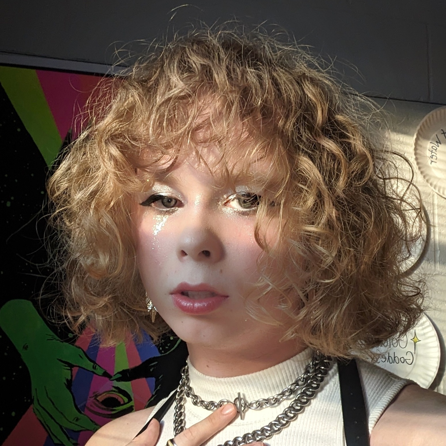
about me !
Basics
nora, 20
she/fae
queer lesbian
taurus, ENFP, 4w3
hopeless romantic
psych & comp sci

Hobbies
gaming
reading
tamagotchi
esports
makeup
photography
web design
blogging
So, Two Sites?
well i'm nora (obviously) and i love messing around with simple (albeit kinda shitty) web design! i decided to split my website into two halfs as i missed this part of web design after making my main page more mobile friendly. it's nice for being a space to read but what about my games? my music? all of that stuff! i'd had enough time and decided i wanted to bring back my old design on a split side of the site, say screw it to mobile compatibility (sorry not sorry! view on desktop or don't view at all!) and just have fun again. it'll distinctively have a more pink/purple aesthetic, while my other half will keep the green/yellow vibe. it's like two parts of me! the silly, sloppy, and dainty vs the refined, perfected, and polished. this isn't saying i love one side more than the other, they both make up very important parts of me. :)
What got you into webmaking?
admittedly my site feels sloppy, and it always will. I'm inexperienced and i'm okay with that. i got into it this summer after the exaustion of always being surrounded by social media (as a lot of my work at college requires me to do so). i also wanted to find a way to host my writings on a website and i got shown neocities! so i was like "hey, i haven't done this before, why not have some fun with it?". consider everything a constant wip, being i'll find some way to improve on it sooner or later. i think that's what i like about all of this. i want to learn more, but there's no pressure to 'be the best' or anything.


